Tayto
Tayto Northern Ireland is an iconic, much-loved crisp and snack brand. The expansive range and outdated packaging was proving difficult to engage a younger audience. The refresh was to capture the attention of the younger audience whilst retaining a very loyal customer base.
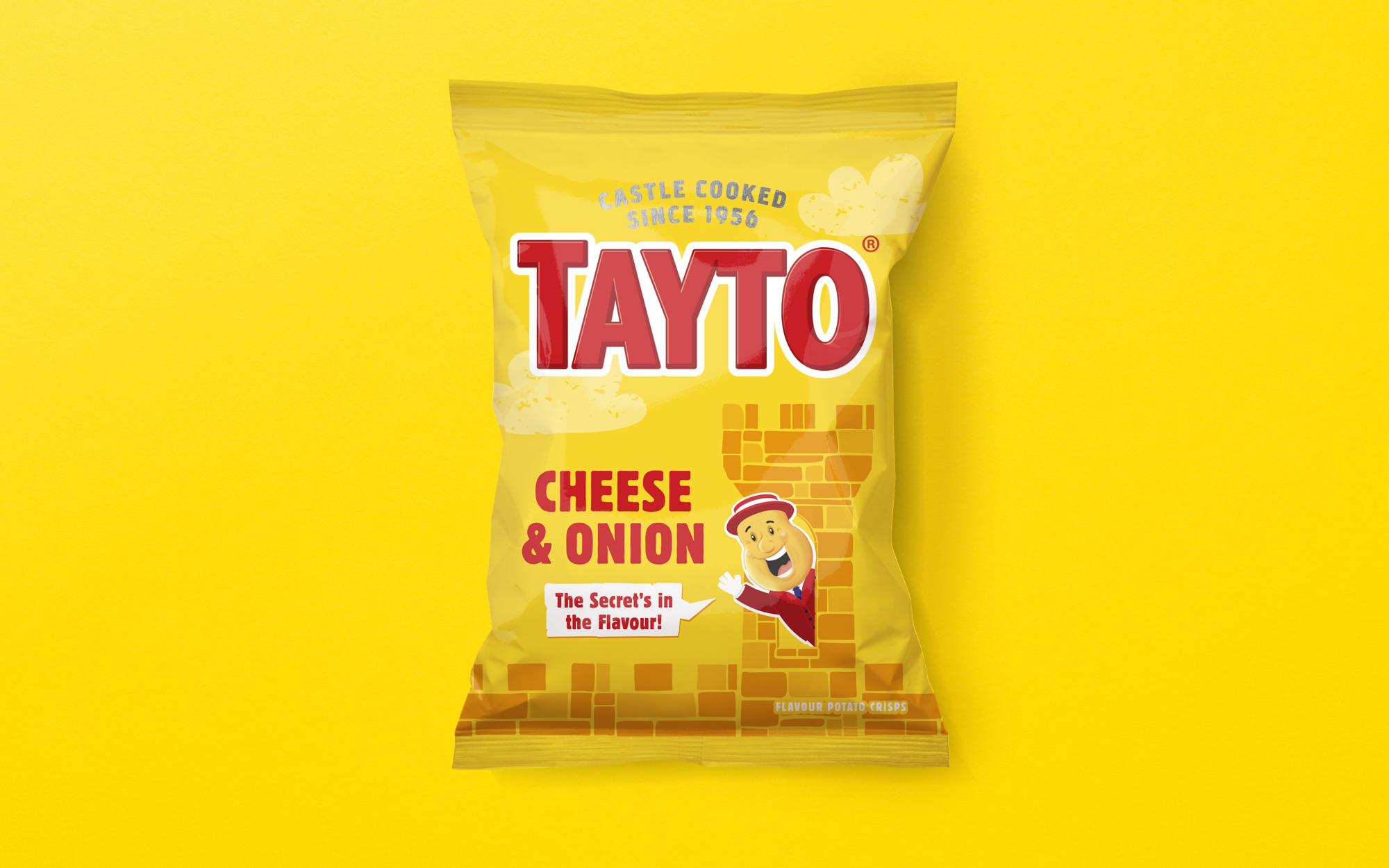
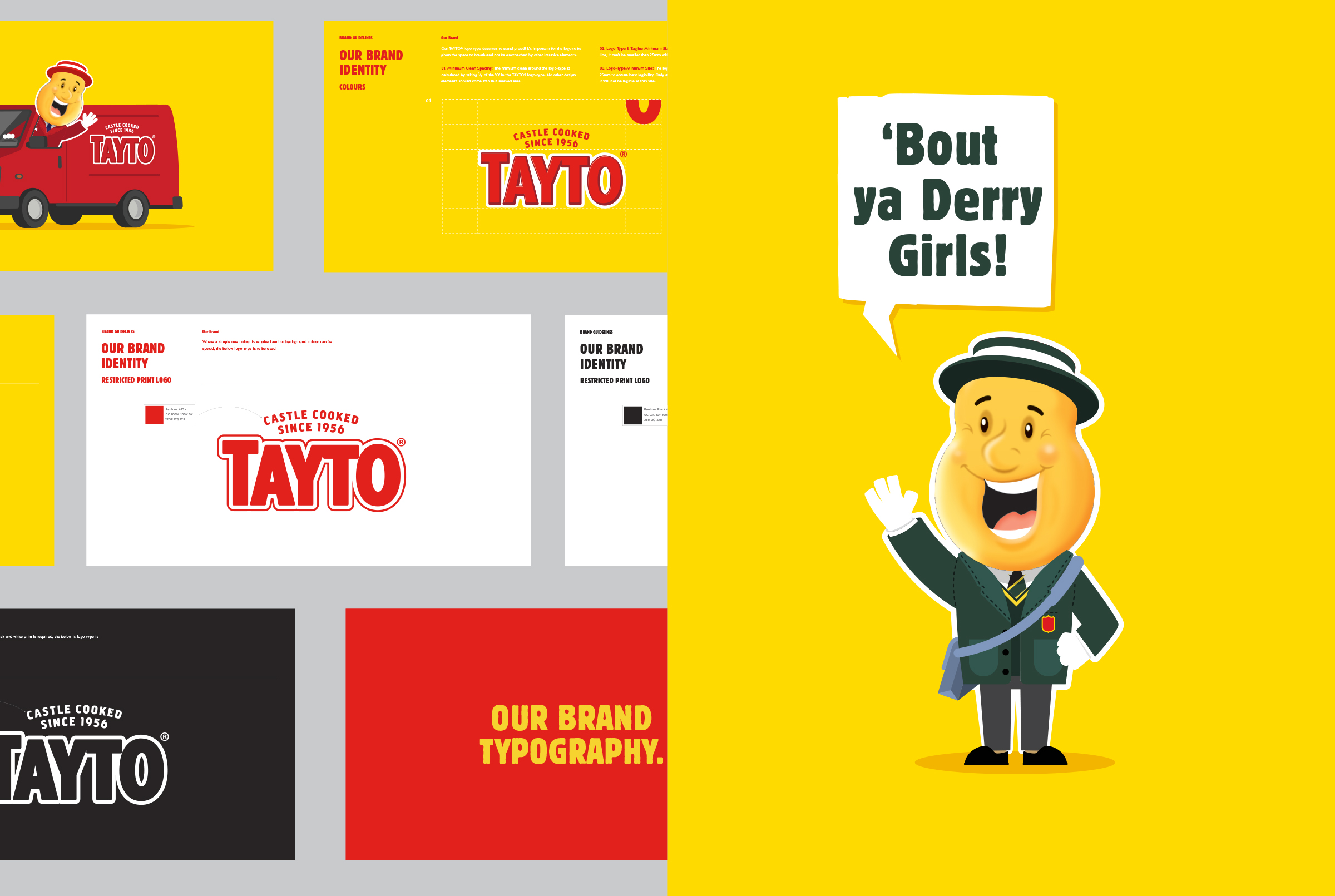
We collaborated on a new brand positioning, focused on a sense of fun and energy previously lacking. The new tagline, ‘Castle Cooked Since 1956’ sits atop the freshly cut logotype. This heroes an important aspect of the unique brand story, that of Tandragee Castle, now known as Tayto Castle, where the crisps are cooked each day.
The pack design develops upon this unique aspect of the brands story and generates an impactful format that accommodates the 10 crisp flavours while retaining a consistent branded look. The messaging hero’s the unique secret recipes of each flavour that are kept safe within the mighty castle walls.
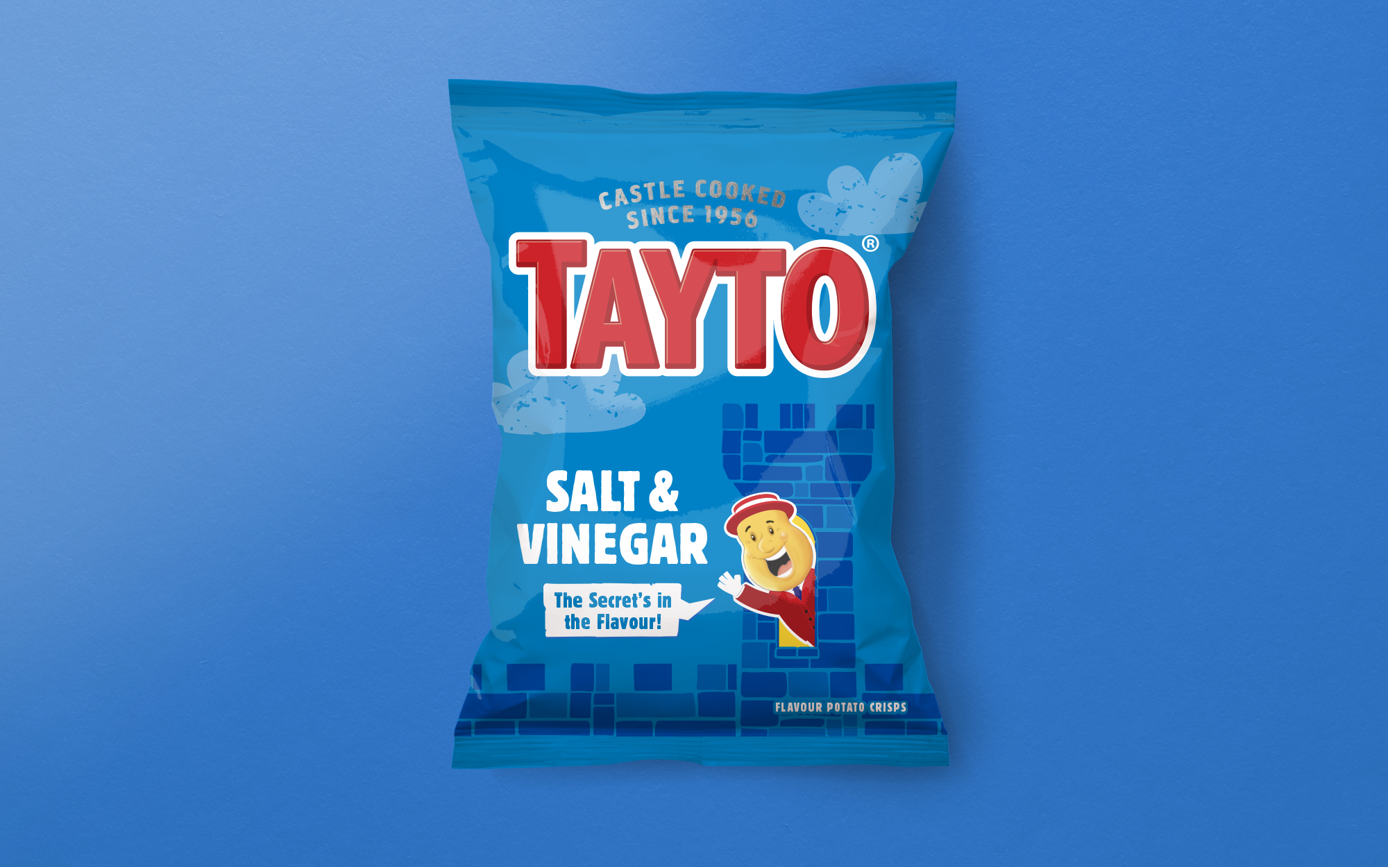
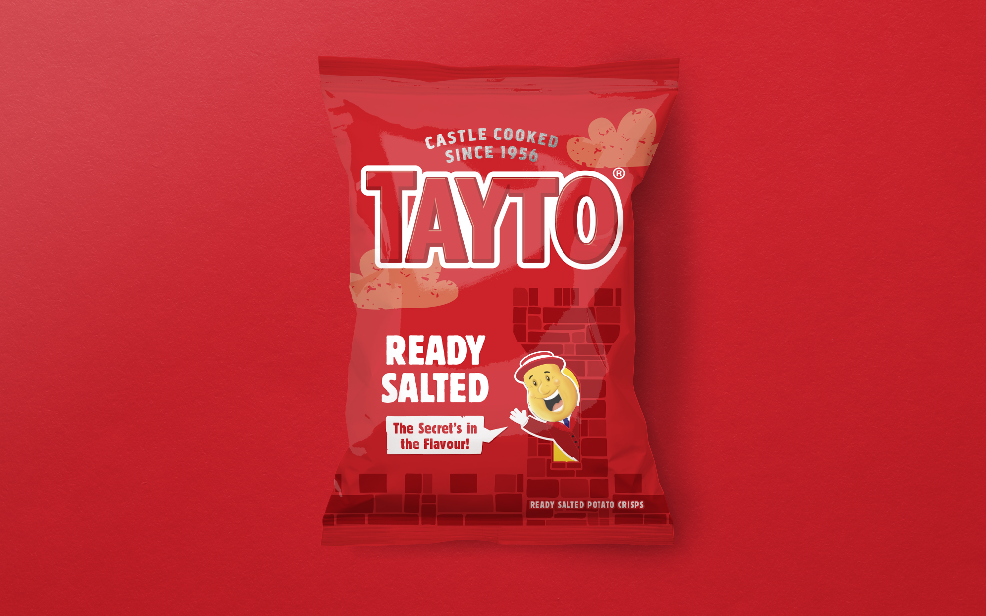
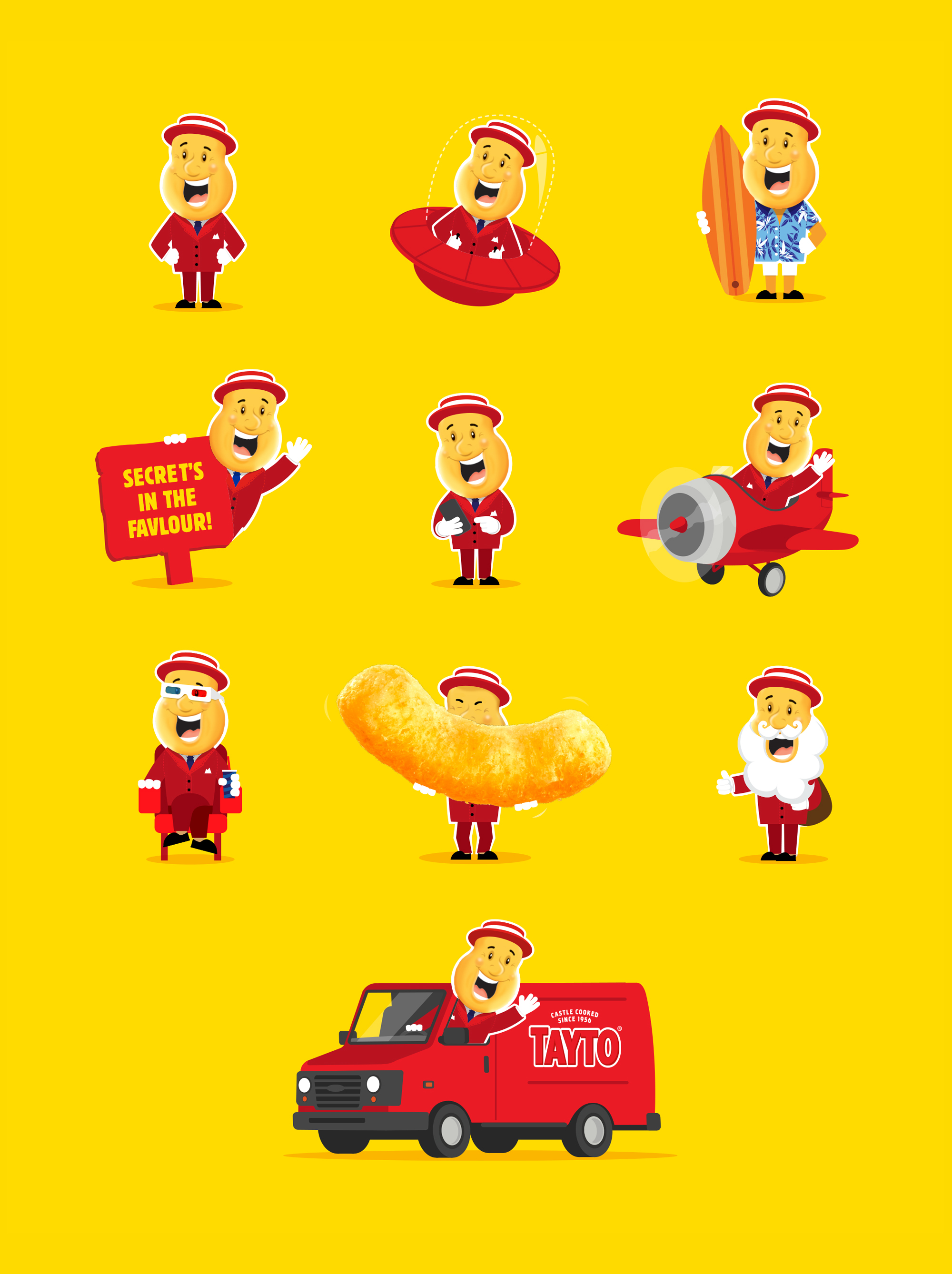
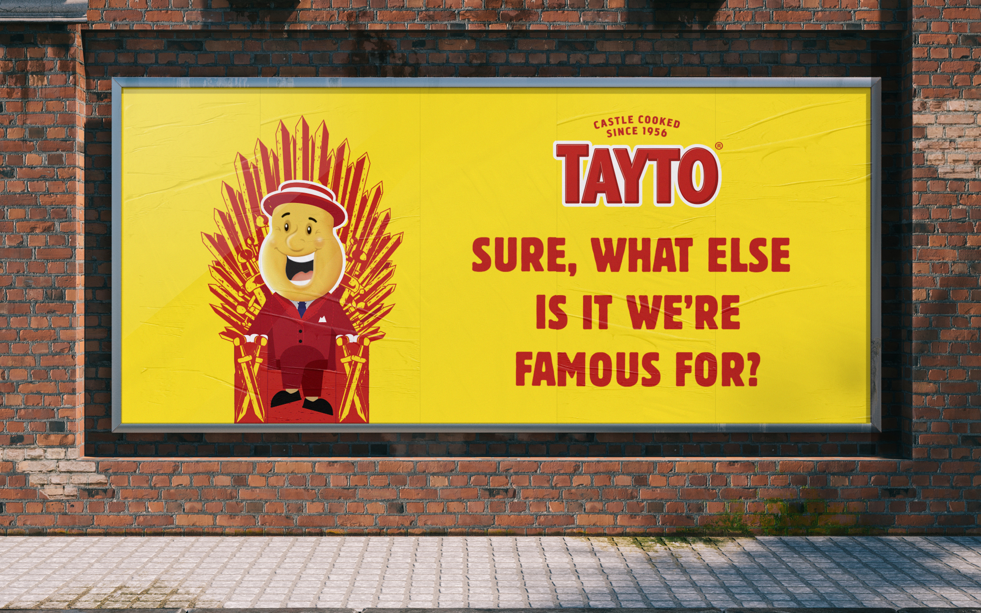
Mr. Tayto is the embodiment of the brand and of the refreshed brand positioning. This intrinsic brand asset has been newly illustrated, capturing his exuberance and personality on each pack.
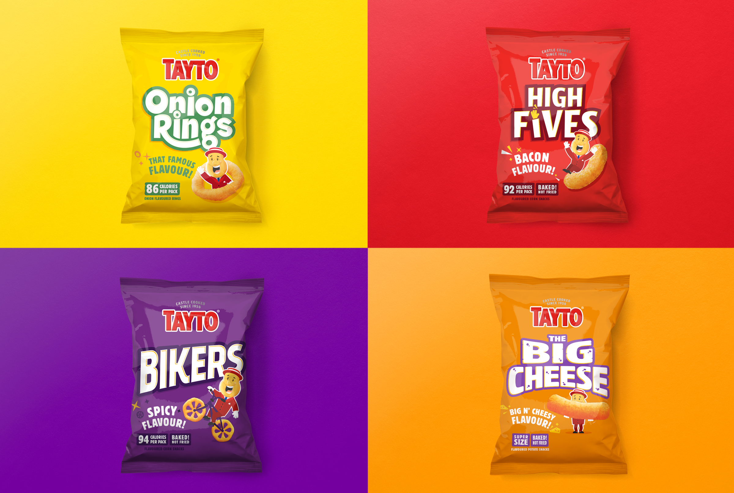
As the range develops, so do the adventures of Mr. Tayto. He is reinvigorated across a suite of sub brands, allowing him to explore new possibilities, whether by spaceship or bike!

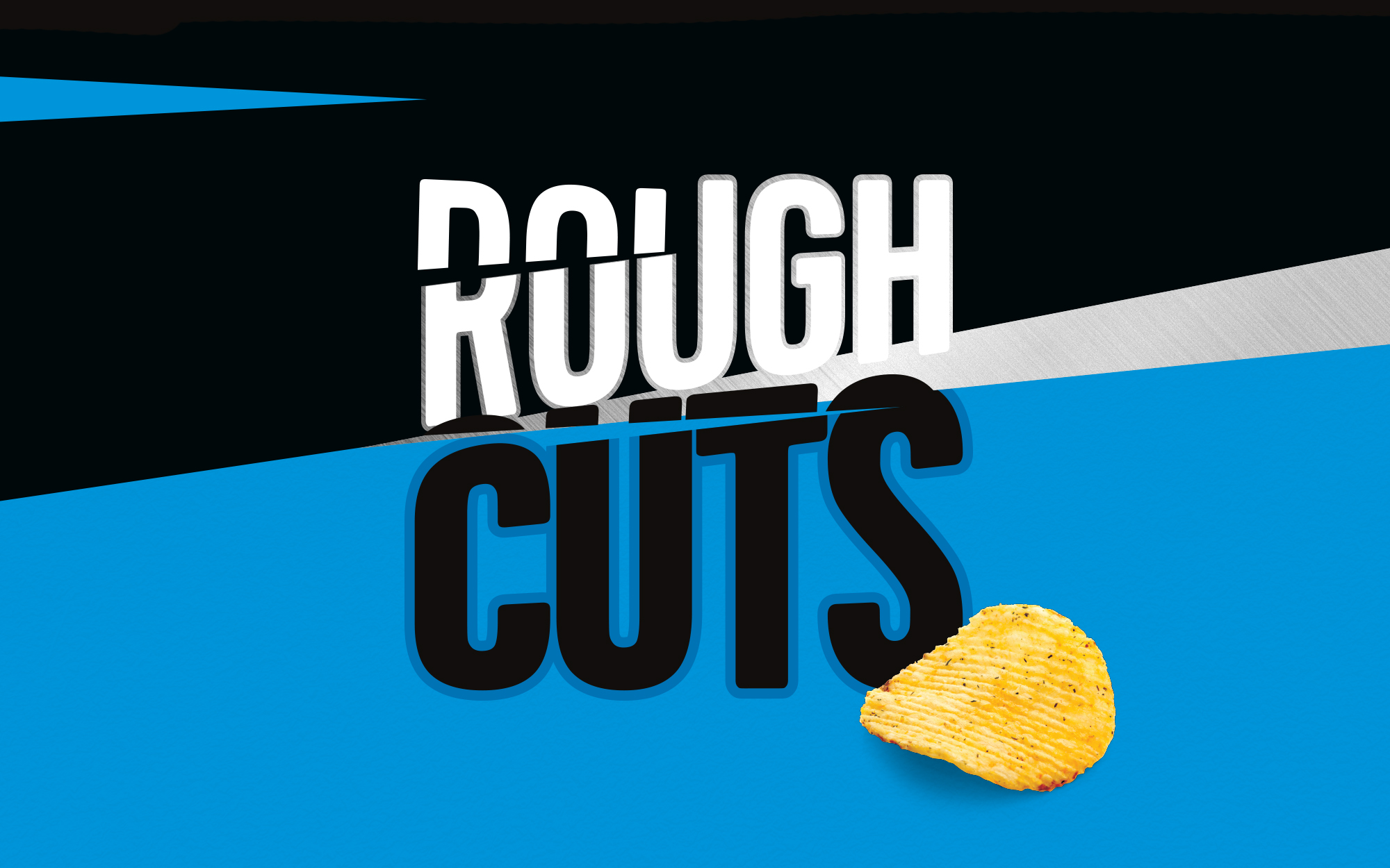
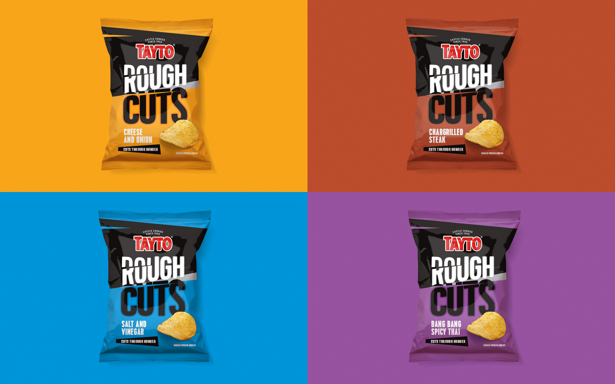
As part of the Tayto refresh we also looked at modernising the Rough Cuts sub-range, a no nonsense ‘hunger satisfaction’ crisp, sure to handle any rumble!

SIMILAR PROJECTS

