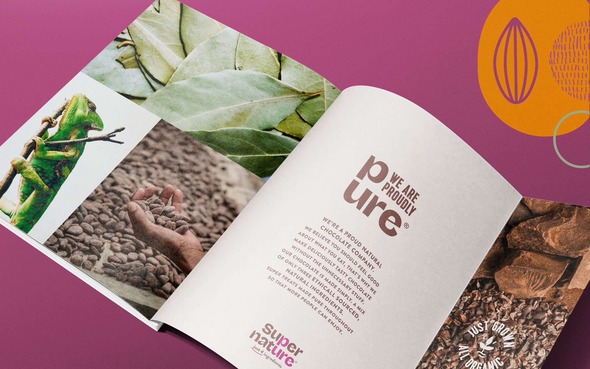
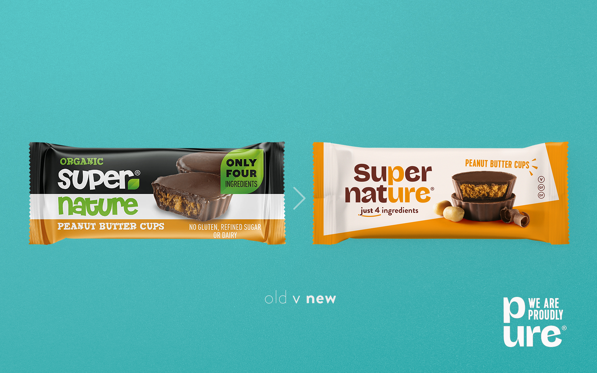
Our brief was to reposition and reinvigorate this growing brand with its refreshingly unique standout clean-deck principles. A chocolate company who make an über clean range of chocolate treats, founded by health necessity but developed to meet a growing market need.
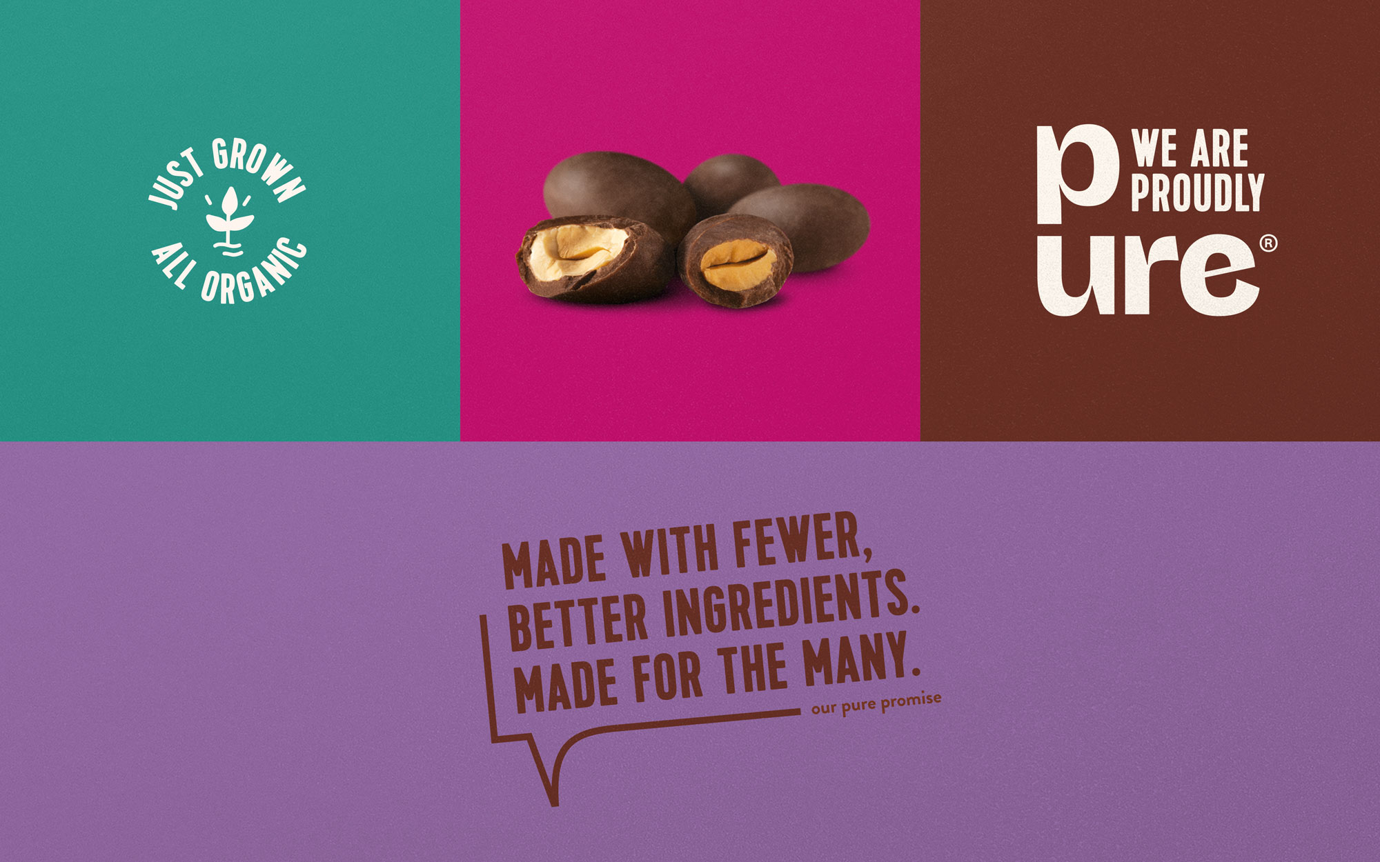
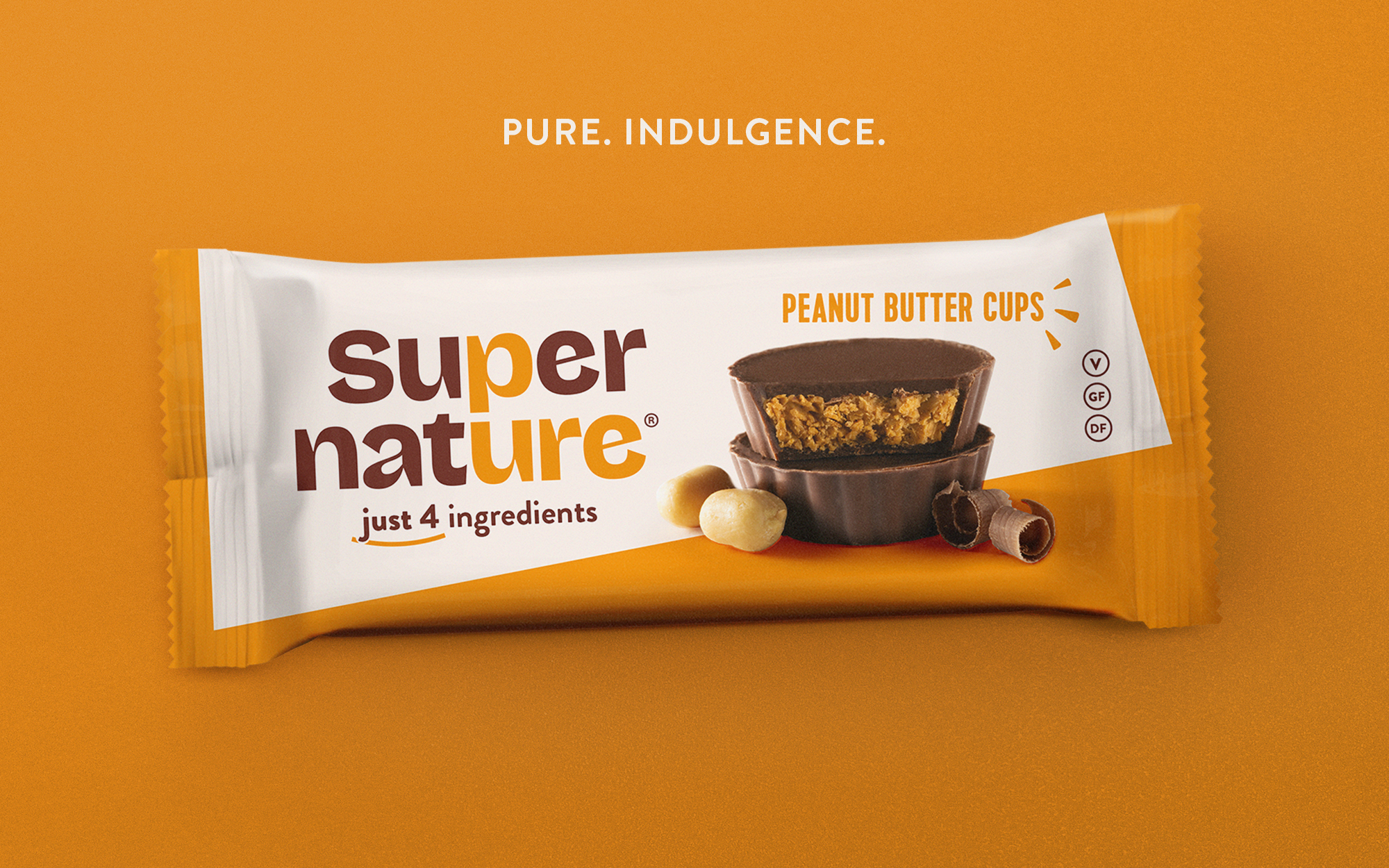
A product made pure, a brand to be proud of, naturally made to enjoy!
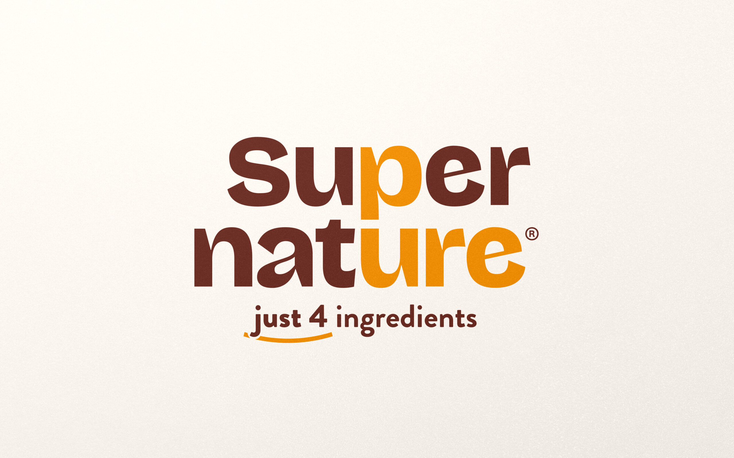
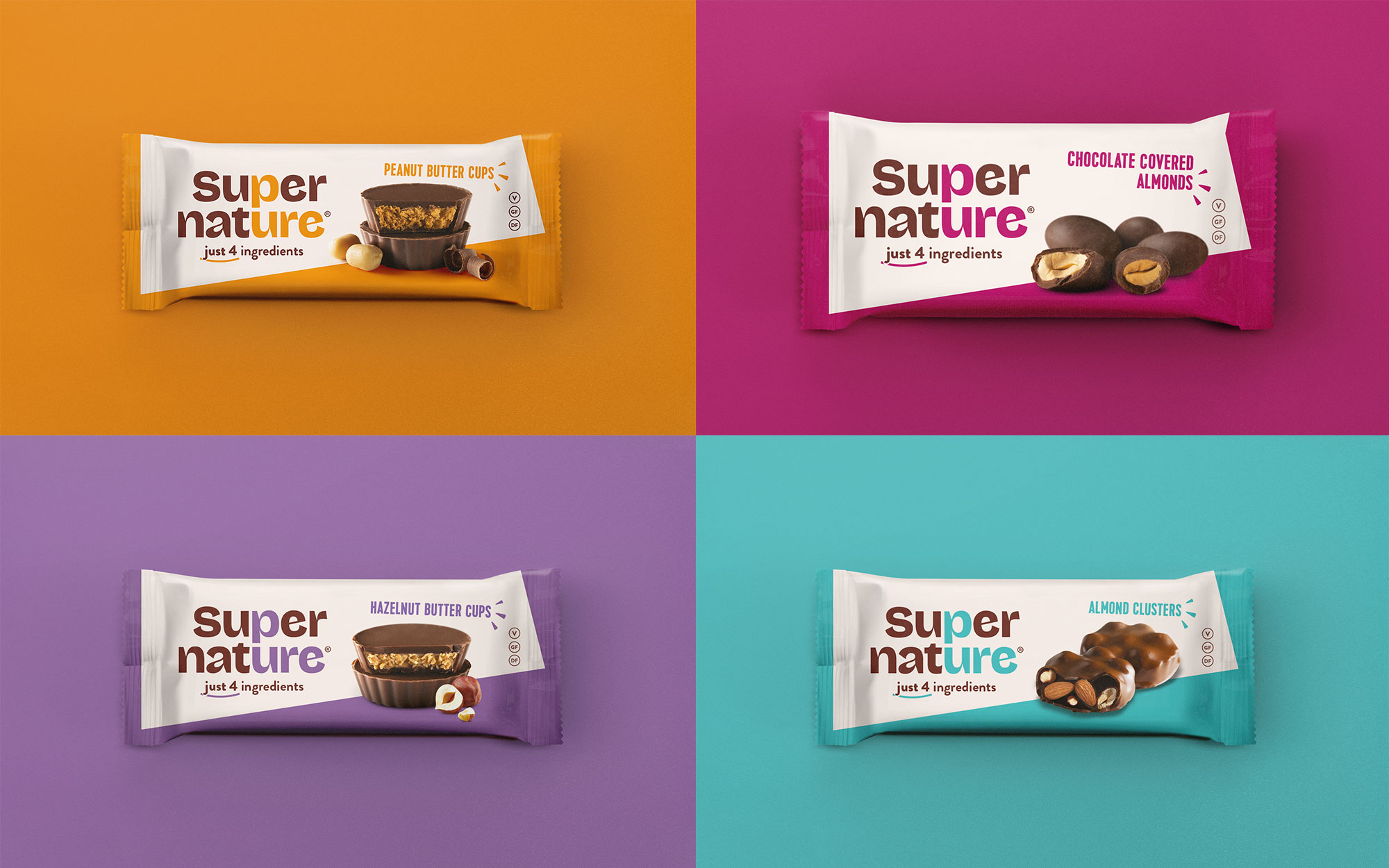
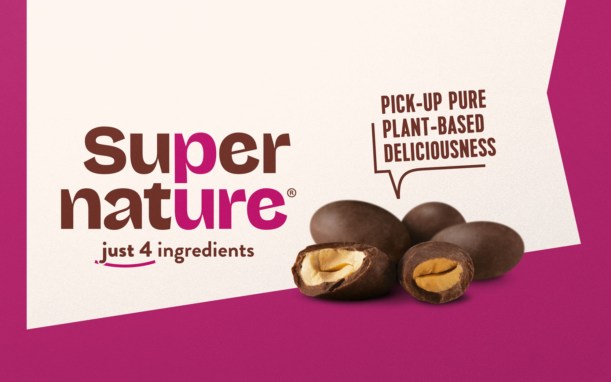
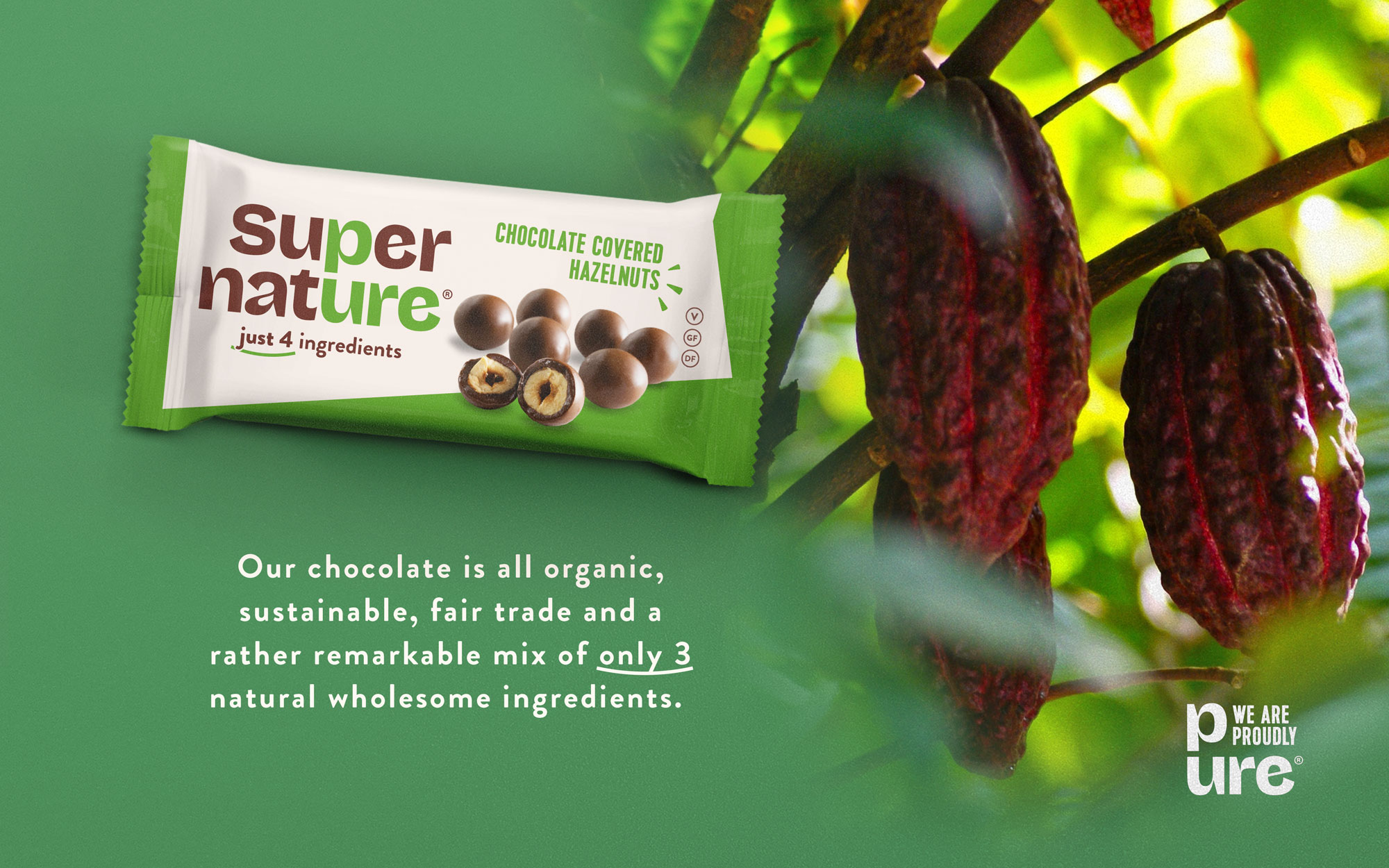
A chocolate treat centred around purity needed to stand out. To bring PURE to the fore, we found it in our brand name. Focusing on this new clear position, we created a strong pack silhouette by stripping back the unnecessary clutter.
The clean declutter gives a fresh focus, along side a tasty confectionery appropriate FMCG product image. Truly a ‘fewer for the better’ look.
The identity and communication are centred around the core belief and company manifesto – PURE INDULGENCE.
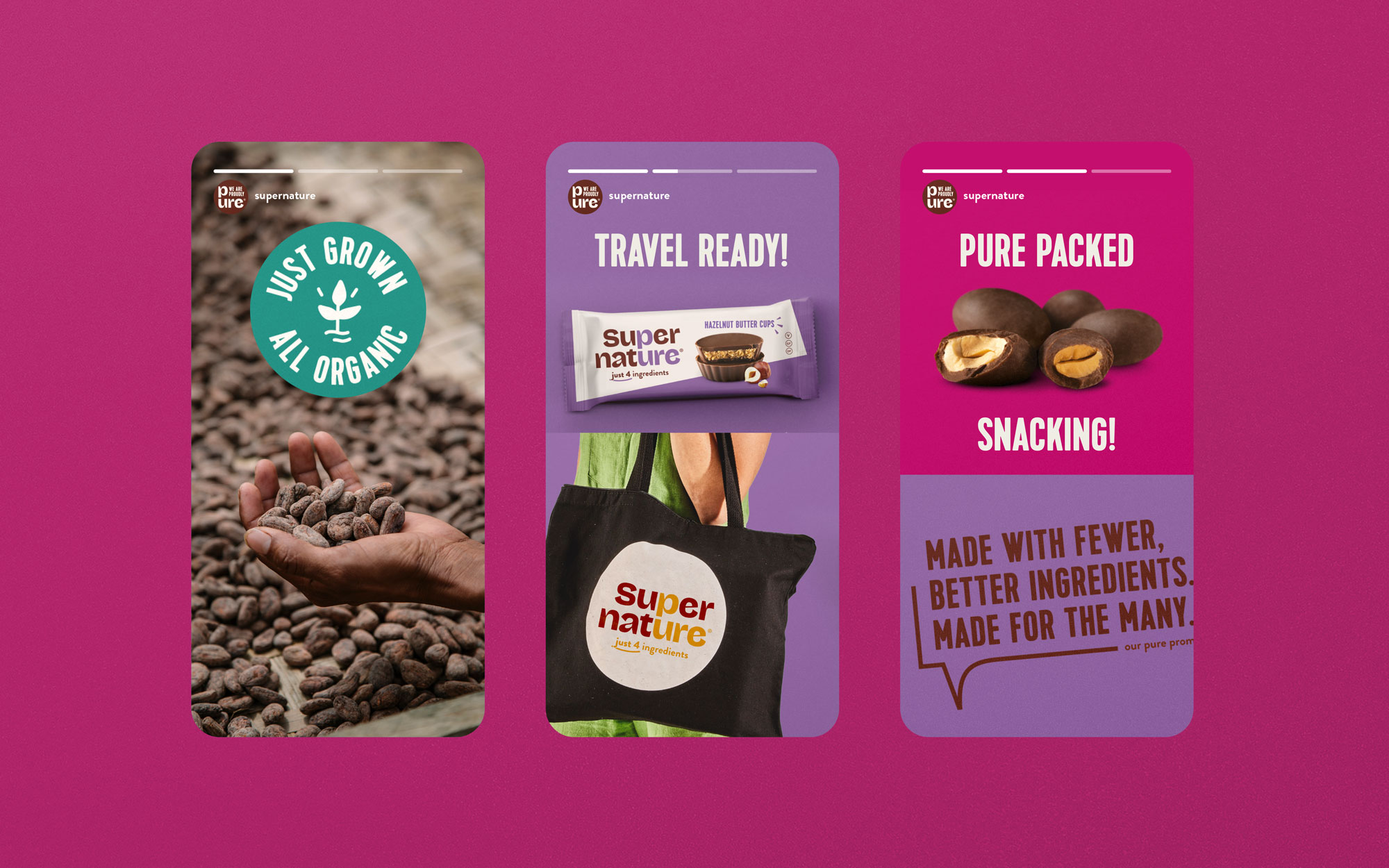
With a fresh, accepting and approachable confident tone, ready to expand and flex to the evolving global natural confectionery sector.
This website uses cookies to improve your experience. We'll assume you're ok with this, but you can opt-out if you wish. Read MoreACCEPT
Privacy & Cookies Policy
Privacy Overview
This website uses cookies to improve your experience while you navigate through the website. Out of these cookies, the cookies that are categorized as necessary are stored on your browser as they are as essential for the working of basic functionalities of the website. We also use third-party cookies that help us analyze and understand how you use this website. These cookies will be stored in your browser only with your consent. You also have the option to opt-out of these cookies. But opting out of some of these cookies may have an effect on your browsing experience.
Necessary cookies are absolutely essential for the website to function properly. This category only includes cookies that ensures basic functionalities and security features of the website. These cookies do not store any personal information.